Optimising visitors' experience at Gardens by the Bay
Created a new itinerary planner feature and enhanced in-app features to help visitors see more, do more and enjoy more at Gardens by the Bay.
2 weeks
On-Site User Interviews, User Research, Competitive Analysis, Journey Mapping, Wireframing, High-Fidelity Prototyping, Usability Testing
Context
Gardens by the Bay is one of Singapore's most iconic attractions, offering a variety of exhibits and outdoor spaces. We wanted to explore how we can further elevate their digital touchpoints to create a digital journey that feels just as thoughtful, immersive and delightful as the physical one.
Challenge
Planning a day at Gardens by the Bay can be overwhelming. Visitors often have to piece together information across multiple platforms by themselves.
Our goal was to find a way to help visitors make the most out of their time at the Gardens by offering a thoughtfully planned experience while reducing the stress of on-the-go decision making.
Solution
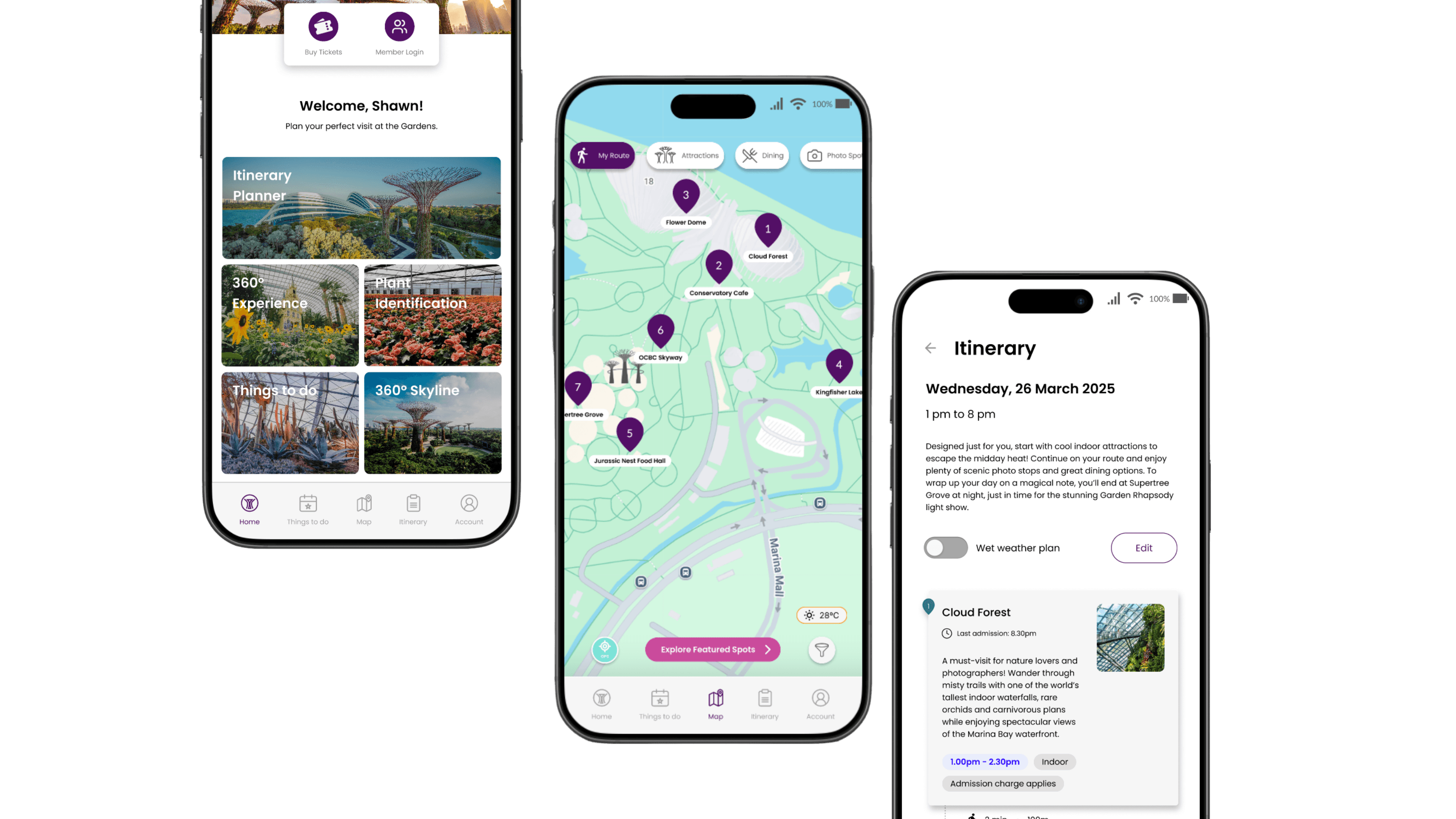
Itinerary planner
Personalised itinerary generation based on visitor needs, visit date and duration
At-a-glance itinerary info, where users can see:
Estimated walking times between attractions
Recommended duration at each stop
Entry fee requirements
Wet weather plan toggle to notify users of removed outdoor attractions and re-plan their route for a smoother experience
Enhanced the current in-app features for better visitor experience


Process
Background Research:
Before designing new features, we assessed Gardens by the Bay's existing digital ecosystem and found it fragmented with gaps in trip-planning support.
Their website offers detailed information about attractions, events and schedules but lacks personalised recommendations for users.
Their mobile app offers strong AR tools like flower identification and navigation, but similarly it doesn't provide comprehensive itinerary planning support.

Research & Analysis
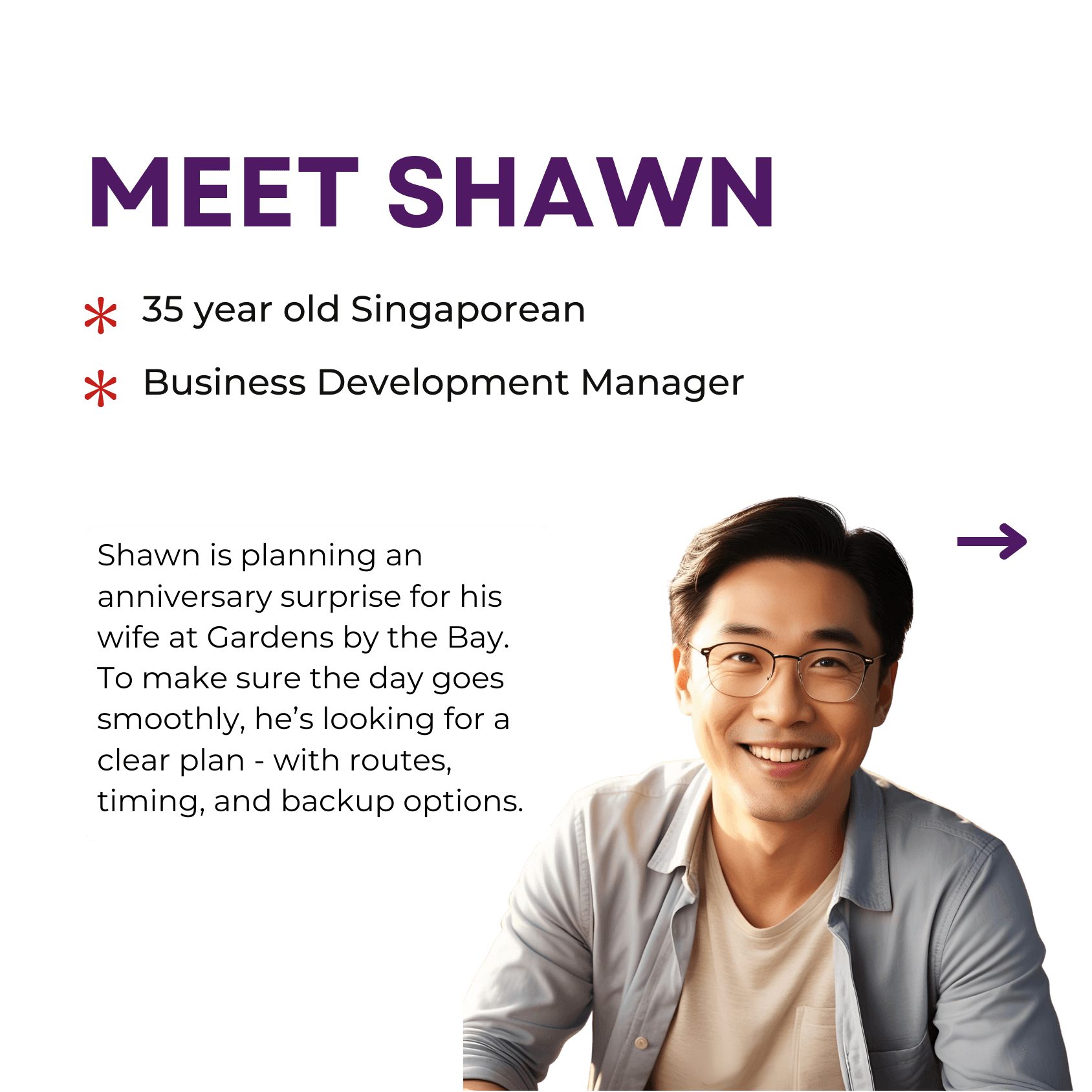
Together with my team, we conducted interviews with a diverse group of users - families, tourists, couples, corporate teams - to understand their needs, behaviours and pain points. From this, we developed two key personas and customer journey maps shown below.


Wireframing and prototyping
We began with low-fidelity wireframes to map out the app’s structure and prioritise key features like the itinerary planner and in-app map features. This helped us visualise user flows early and align on core interactions.

From there, we created high-fidelity prototypes with UI components and interactive elements to bring the experience to life. These focused on intuitive navigation, clear access to information, and filtering options for photo spots and seasonal highlights — directly addressing user pain points uncovered during research.
Usability testing
We headed down to Gardens by the Bay to test out our prototypes to validate our design. Here's what we found:
Users liked that they had the flexibility to customise the planner to fit their preferences.
Potential impact
Optimising the visitor journey does more than enhance visitor satisfaction—it drives tangible business growth for Gardens by the Bay.
More time spent at the Gardens means more opportunities to dine, shop and explore. An itinerary planner helps visitors make the most of their visit, reducing time spent figuring out their next stop while also drawing visitors to under-explored areas.
Overall, a smoother visit translates into greater enjoyment, leading to positive word-of-mouth and repeat visits, all of which fuel long-term revenue growth. As the Gardens continues to expand, strengthening its digital touchpoints is critical to drive long-term business growth. Research shows 80% of people are willing to pay more for a better user experience, highlighting how intuitive digital interactions can directly influence revenue.
Curious about this project or looking for a UI/UX designer to bring fresh perspectives to your team? Let’s connect!

